
POOR DESIGN – Kim Kallie
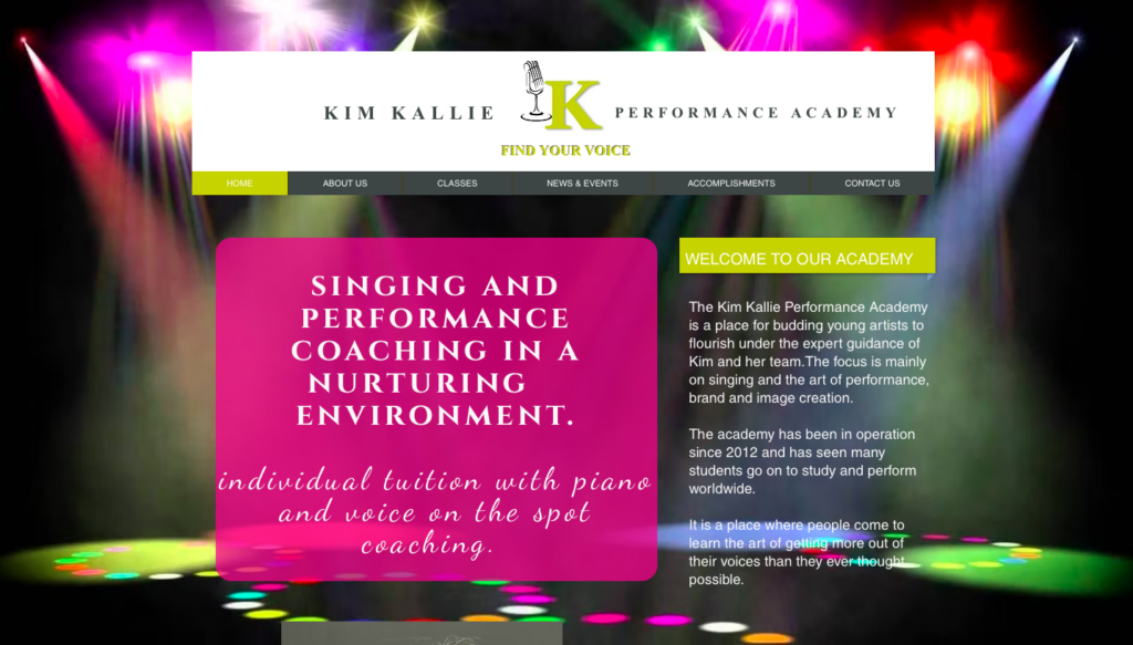
Overall Design – 3/10
- The overall design of Kim Kallie Performance Academy’s website communicates an almost retro aesthetic with an emphasis on drama and flair. The plethora of various neon colours throughout the site and the different font styles add to this chaotic drama, hinting at the academy’s emphasis on dramatic performances. While these various design choices may convey the vibrant nature of this academy, they diminish its integrity and legitimacy. Viewers may feel that the website is not genuine and is trying to gain customers simply through extravagance.
Navigation – 4/10
- This website’s navigation is straightforward and generally works well without an issue. Nearly every linked button throughout the website is linked to one of the six site pages. The remaining buttons work well with minimal issues. However, these buttons/links could be placed more effectively. For example, there is only one button that leads to an application form, and it is on the home page. This link should be added to at least the “Contact Us” and “Classes” pages.
Functionality – 4.5/10
- This website immediately lets you know its purpose. Viewers quickly understand that it is marketing a singing and performance academy. Furthermore, the picture of Kim Kallie on the main page and information about her musical journey on other pages adequately reveal who oversees the company. However, the site could do a better job of answering probable questions viewers might have, such as whether the academy is based at a specific school, studio, or primarily online. Each page contains a ton of text but comparatively answers few questions. A Q&A page might be an effective addition to solve this problem.
Content Quality – 2/10
- As mentioned previously, while this website contains a lot of text, the text’s content is relatively superficial. Feel-good words like “courage,” “self-discipline,” and “expert” are thrown around, but much of the website provides a poor idea of how the academy intends to help students achieve these goals. Instead, greater focus is put on parading past students and their achievements. While this promotion technique is an important aspect of marketing, it can quickly become distasteful. In addition to the poor content quality, the actual grammar and paragraph styling of this website need to be much more unified and precise.
Site Effectiveness – 1.75/10
- This website promises a professional music and performance education. It even claims to focus on branding and image creation. However, its unprofessional marketing and poorly crafted content undermine these ideals. Its unskilled website design hints at unskilled teaching. If Kim Kallie Performance Academy wishes to grow, changes to its online presence and branding must be made.
EXCELLENT DESIGN – Online Singing Institute
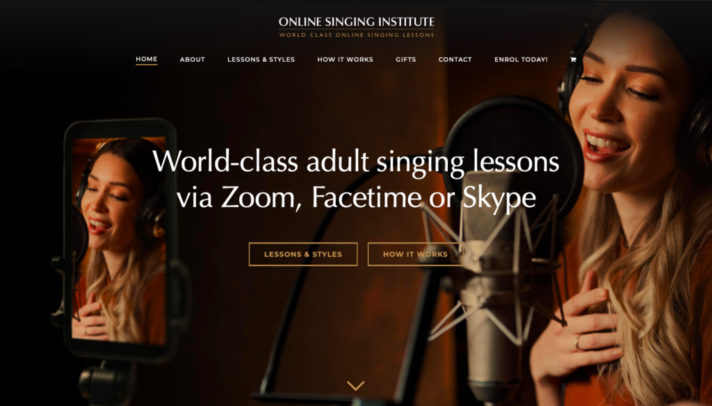
https://onlinesinginginstitute.com
Overall Design – 9.5/10
- The overall design of Online Singing Institute is classic and elegant. The warm brown tones and sophisticated font choices found throughout the website provide a strong sense of unity and cohesion. With a clearly defined, unified purpose and easy navigation, this website effectively markets the company’s online singing lessons.
Navigation – 10/10
- The navigation of this website is very efficient. While visitors can quickly find the information they are looking for, almost every aspect of the site is encouraging them to sign up for singing lessons.
Functionality 9/10
- This site functions effectively because it presents the intended message – “Come take our singing lessons online!” – in an aesthetically pleasing manner. Because most music-lovers enjoy aesthetics, this will encourage them to explore the website further.
Content Quality – 10/10
- The content of this site is carefully crafted. From paragraph headers to article images, each content element promotes the general vibe and message of the institute’s marketing. Nearly nothing is just for show – everything has a purpose! This prevents overstimulation.
Site Effectiveness – 10/10
- This site presents a problem: the difficulty of taking in-person singing lessons. It also presents a solution: joining the Online Singing Institute. By presenting this solution in an aesthetically pleasing, unified, and professional manner, it wins over potential customers and effectively encourages them to join the institute.
No responses yet