
POOR DESIGN – Anna Pumer Photography
https://annapumerphotography.com
Overall Design – Ranking 3.5/10
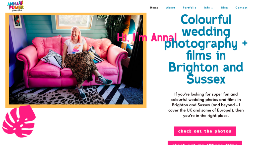
- The overall design of Anna Pumer Photography has been clearly crafted towards a distinct theme: bright, colourful, and eccentric. This theme is reflected in the wedding photography Anna Pumer presents on this website. While this may appear to be a good marketing strategy, it is executed badly. The constant chaos and lack of organization warn of unprofessionalism and inefficiency. This lack of focused depth will inevitably drive viewers away, even if they wish to have chaotic wedding photos.
Navigation – Ranking 4/10
- This website’s navigation is straightforward and works well without an issue. All the links work, and button placement is generally quite logical. However, some of her navigation choices could be much more effective. For example, the two buttons at the top of her home page, “check out the photos” and “check out my iPhone films,” break up the eye flow and are quite unnecessary. Both content types are briefly presented right below these buttons, which is what viewers are looking for.
Functionality – 4.5/10
- Due to the site-wide chaos, it is somewhat difficult to find what information you are looking for. Many viewers will most likely be in the middle of looking at several wedding photography websites when they stumble upon this one. If it takes unnecessary time to find the information they need due to chaotic organization, they will probably move on to a different website. Thus, this site has poor functionality.
Content Quality – 2/10
- Lack of professionalism not only appears in this website’s design but also in its content. The actual showcased photography is mediocre, but the copy is very poorly written. Typos, incorrect grammar, and slang riddle this website. This creates both unattractive pages as well as poor communication.
Site Effectiveness – 2/10
- Anna Pumer seems to be sprinting away from all that is traditional, organized, and professional. She spends more time talking about her own personal hobbies than her strategy for making sure consumers are satisfied. While this choice does communicate what her wedding photography is like, this kind of design does not encourage people to trust her methods. It guarantees few outcomes and promises little stability. Is this personable? Yes. Is it promoting trustworthiness? No.
EXCELLENT DESIGN – The Paris Photographer
https://www.theparisphotographer.com
Overall Design – 9.5/10
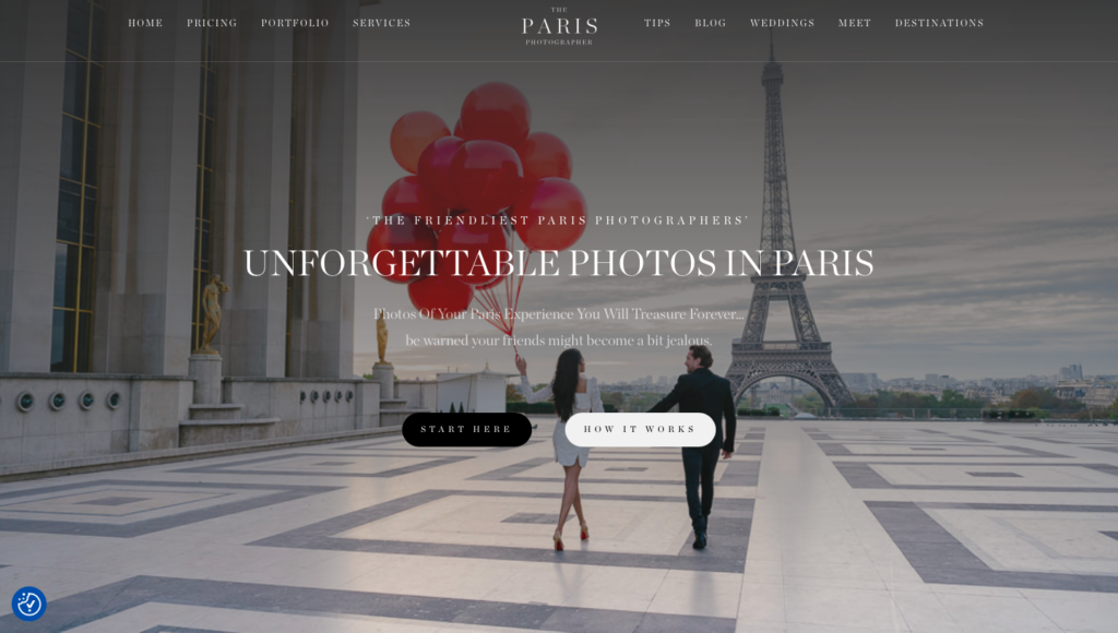
- The overall design of The Paris Photographer is classic and elegant. The aesthetically pleasing photos and the sophisticated font and colour choices present a dreamy photography business which focuses on telling stories through their photography. The website guarantees professionalism, promises satisfying results, and shows how they will accomplish those goals.
Navigation – 9/10
- The navigation of this website is very effective. Each page is linked to in the header, and all the buttons are placed logically in context. Furthermore, the “START HERE” button on the homepage is an efficient but tasteful way to present viewers with a call to action. One possible critique is that some viewers may get lost in the extensive sections of content on the homepage, but this may be simply due to the nature of portfolios.
Functionality 10/10
- This site functions effectively because it presents the intended message – “Book us!” – in a professional and unified manner. With site-wide unity, viewers quickly understand what The Paris Photographer’s photography is like, creating a brand image in their minds.
Content Quality – 10/10
- With eye-catching visuals and easy-to-read copy, this website not only communicates efficiently but also aesthetically. While other types of websites may get away with less attractive content, photographers depend on content to market themselves. The Paris Photographer’s carefully chosen portfolio upholds unity while showcasing the scope of his skills.
Site Effectiveness – 10/10
- This website is nearly perfectly effective. It draws viewers in with attractive visuals, communicates efficiently with clear copy, and provides easy site navigation. Furthermore, through all of this, the site maintains brand unity and continues to target a specific audience. This skilful website creation indicates skilful photography.
No responses yet